Editorial, Industrial Product, Visual Ads & Communication Design
Challenge
Create the best product collection to date for the Padel Varlion brand, trying to give an Innovative style oriented to the concept of F1, a sector in which the brand at that time was opening the market with a new line of textile products.
Strategy & Solution
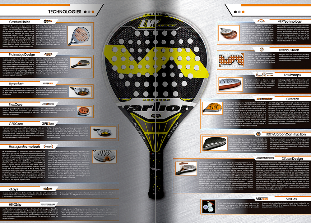
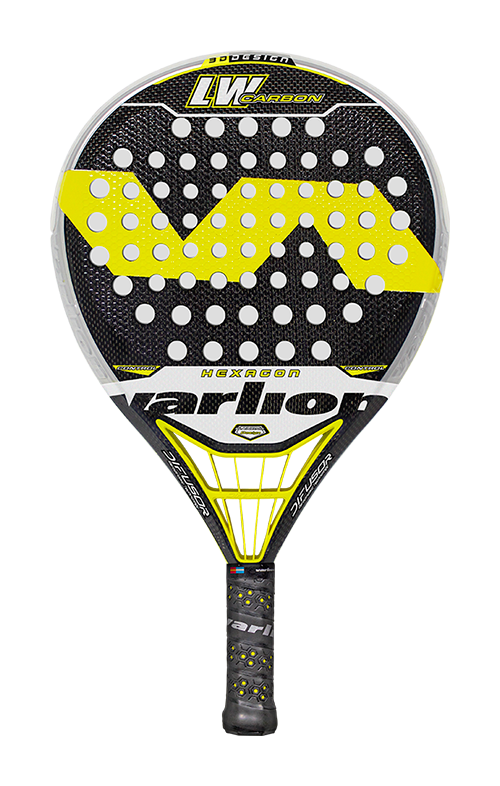
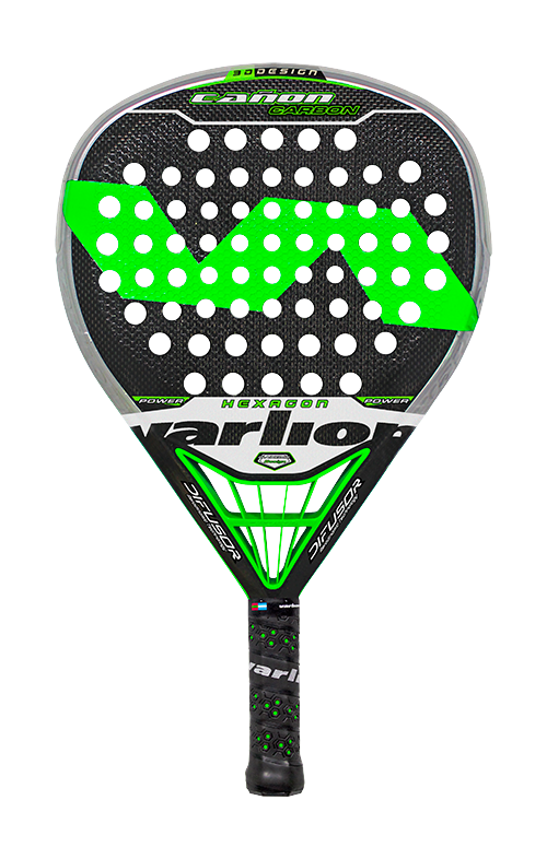
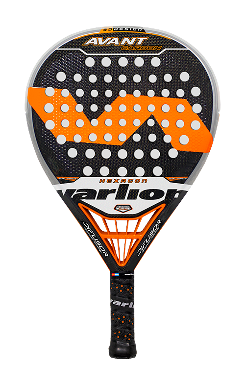
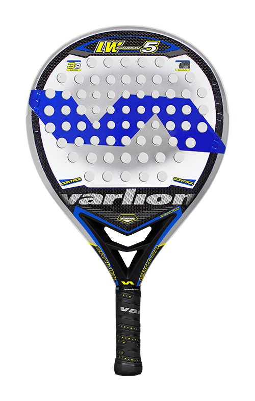
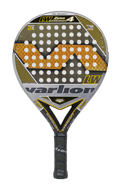
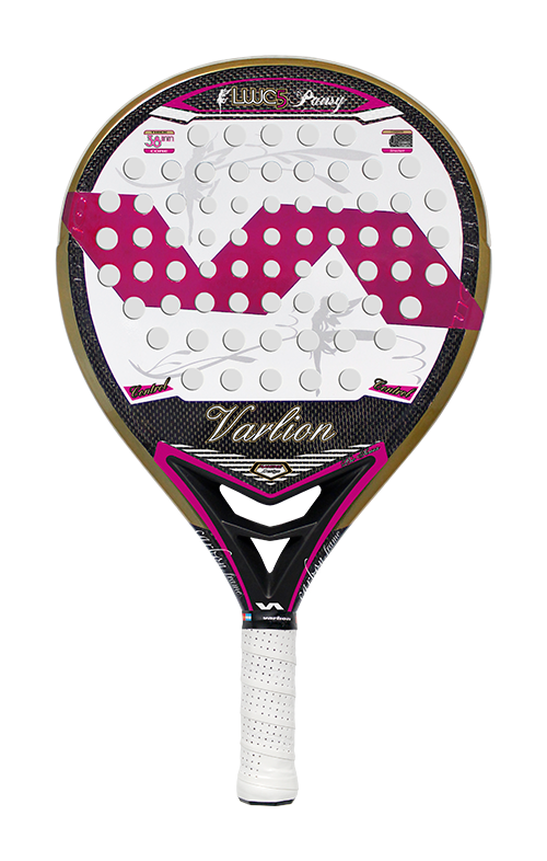
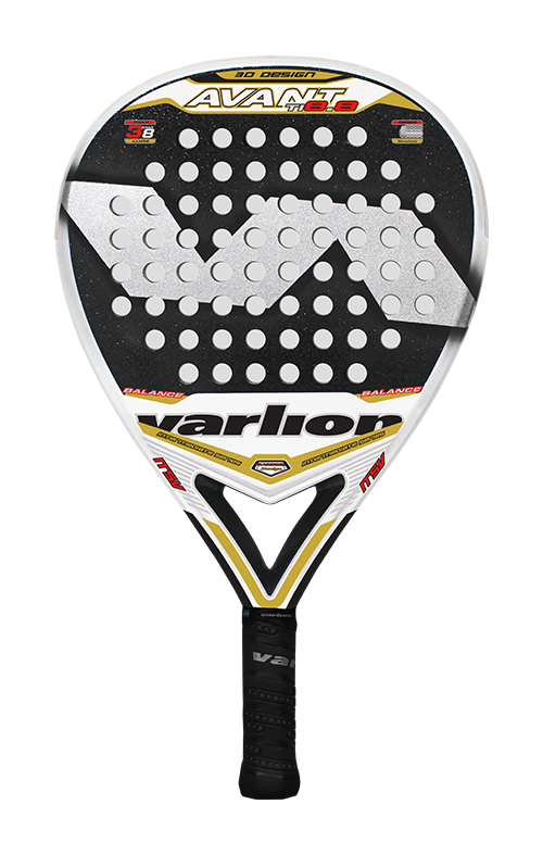
To achieve that sportier line that would convey an F1 Racing concept, it was thought to integrate into the Top model of the racket collection, a piece of plastic located at the heart of it simulating an F1 diffuser, this being the same name, that they would adopt for Top range of products. To create the different designs for each range of products, I am looking to give the Imago a lot of presence within minimalist designs marked by lines and almost right angles with a great sporty technological character.
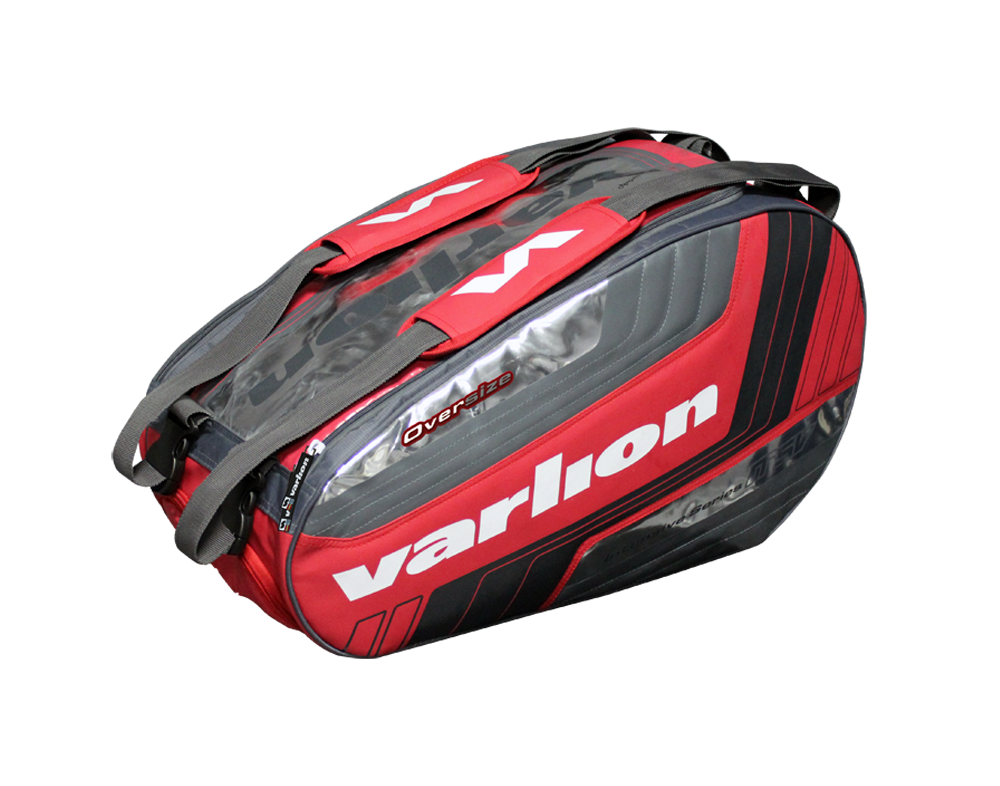
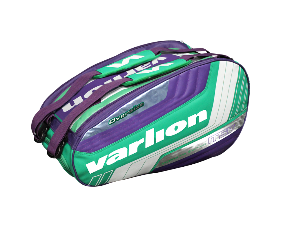
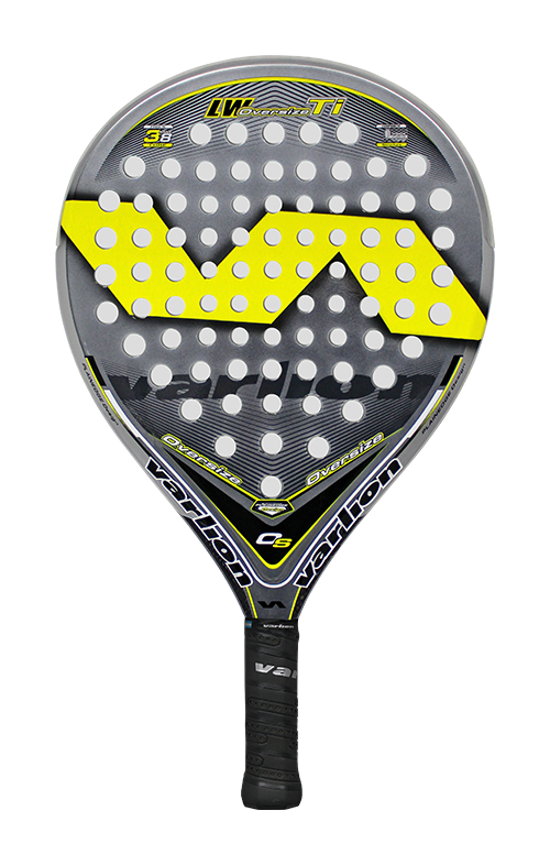
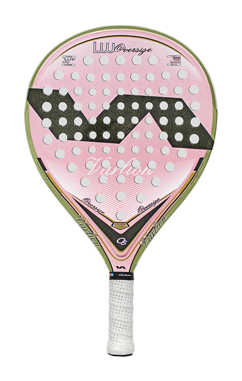
Varlion Padel Products
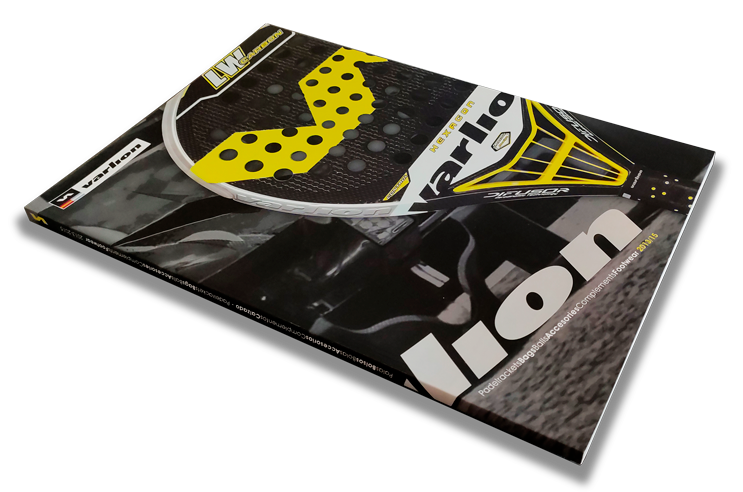
Editorial Catalog
The same concept and idea of the Racing collection moved to the interior and exterior visual image of the brand’s Padel product catalog, the main protagonist being one of the Hexagon Diffusor models from the Top range of Padel rackets. The interiors of the catalog were worked to the millimeter to give a layout that combined a minimalist and technical image, despite the great information they contained per page. Using transparencies for the covers of each section as a creative element to differentiate.
Products Collection
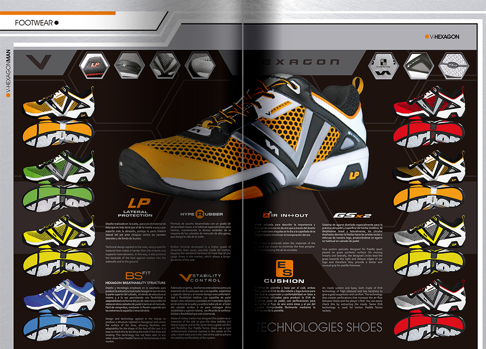
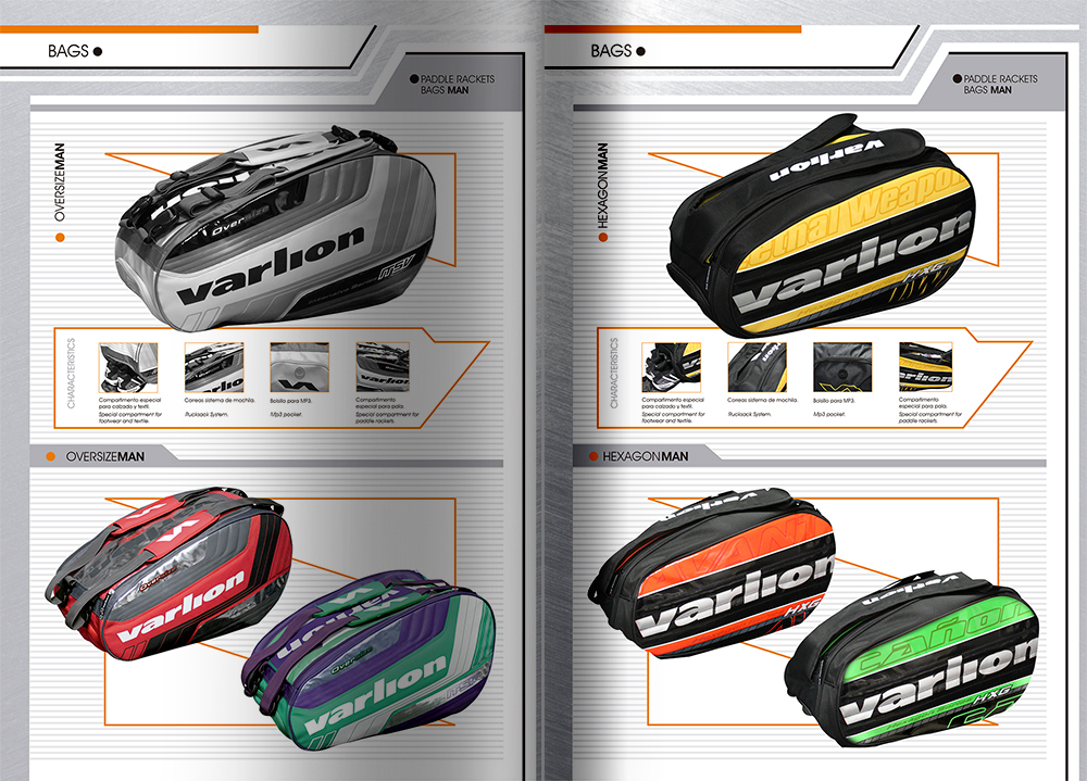
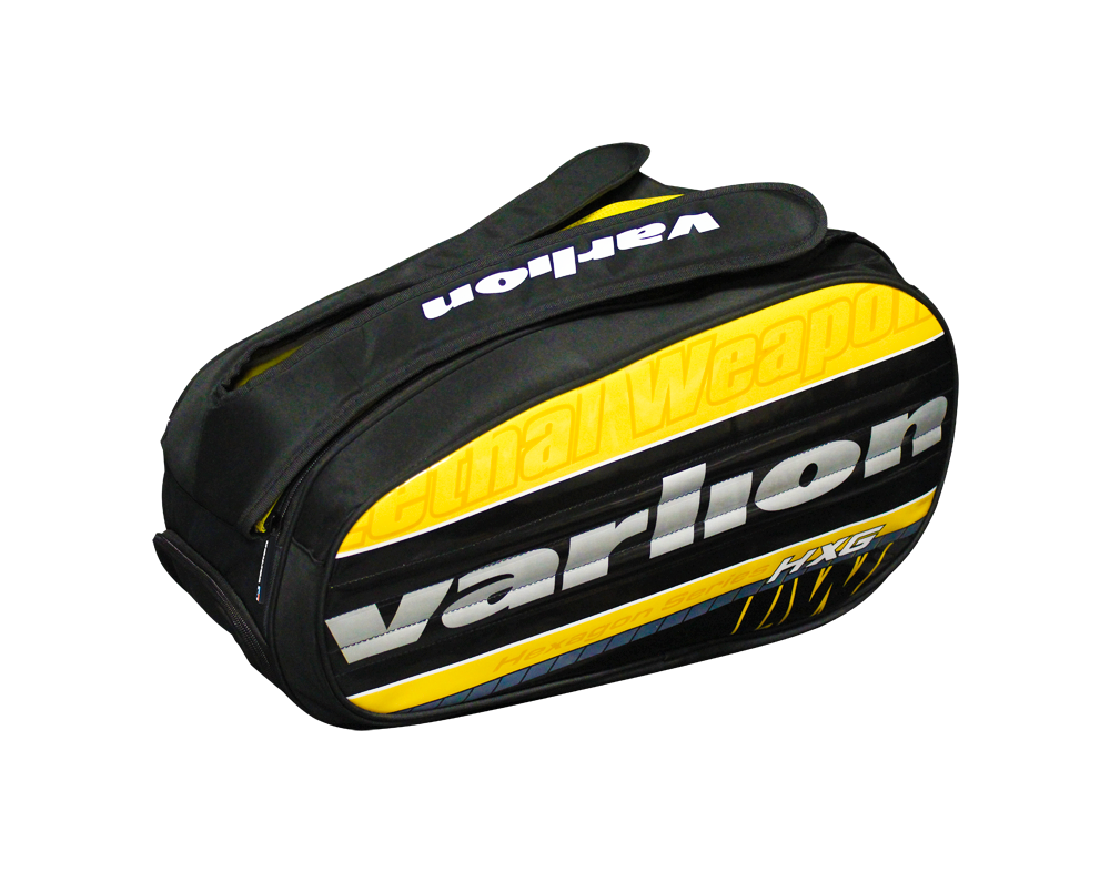
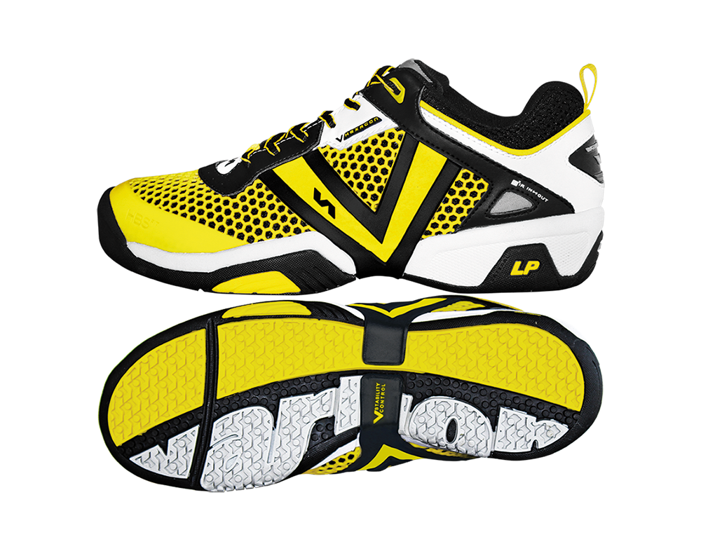
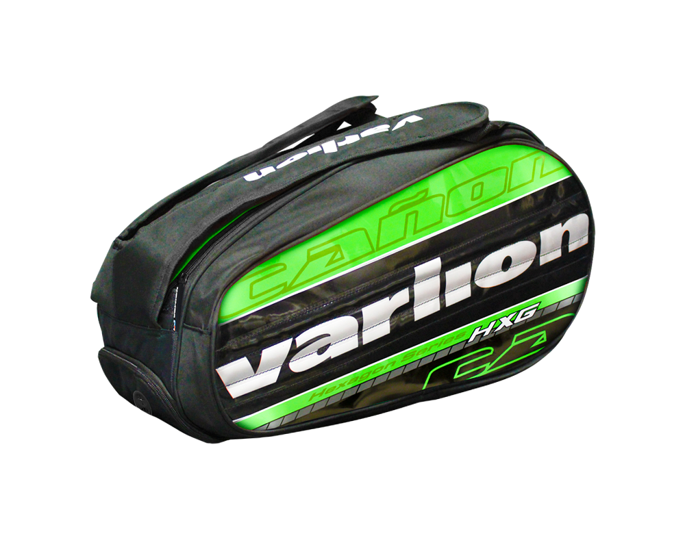
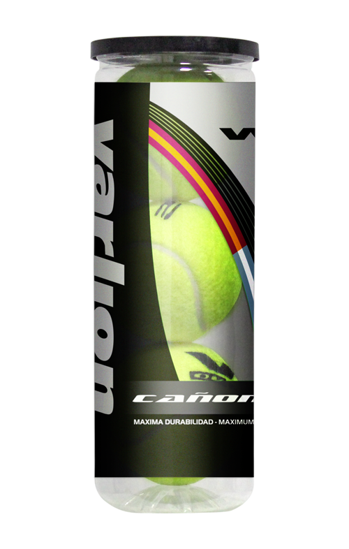
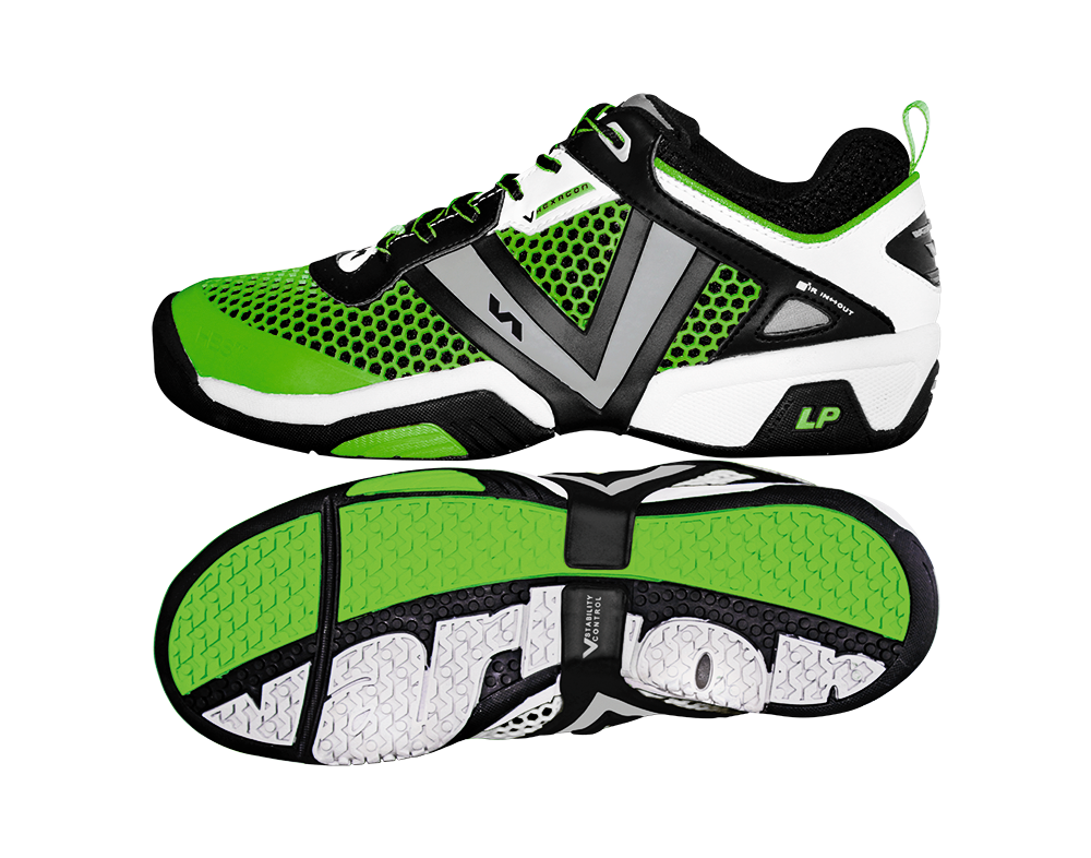
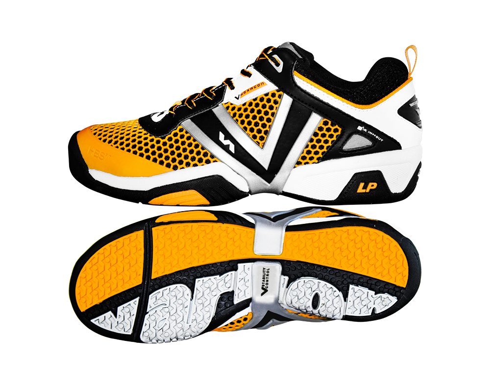
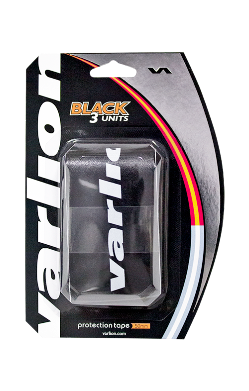
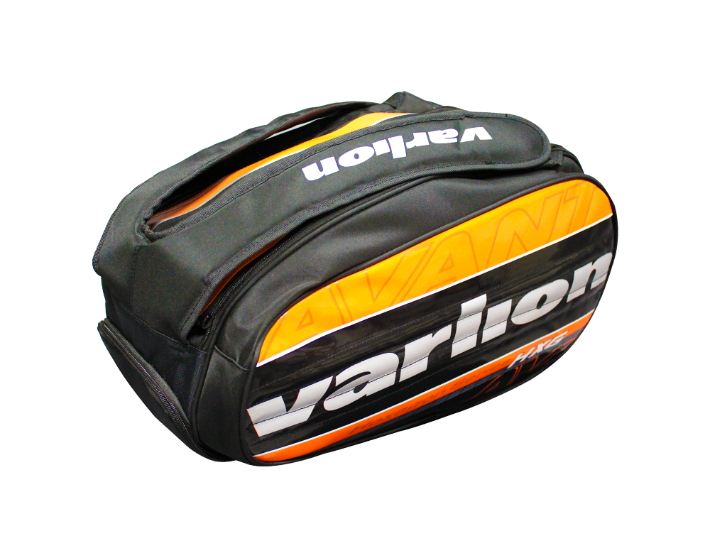
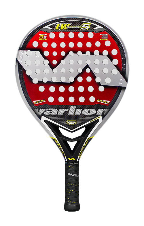
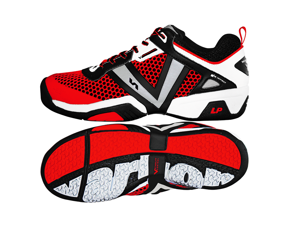
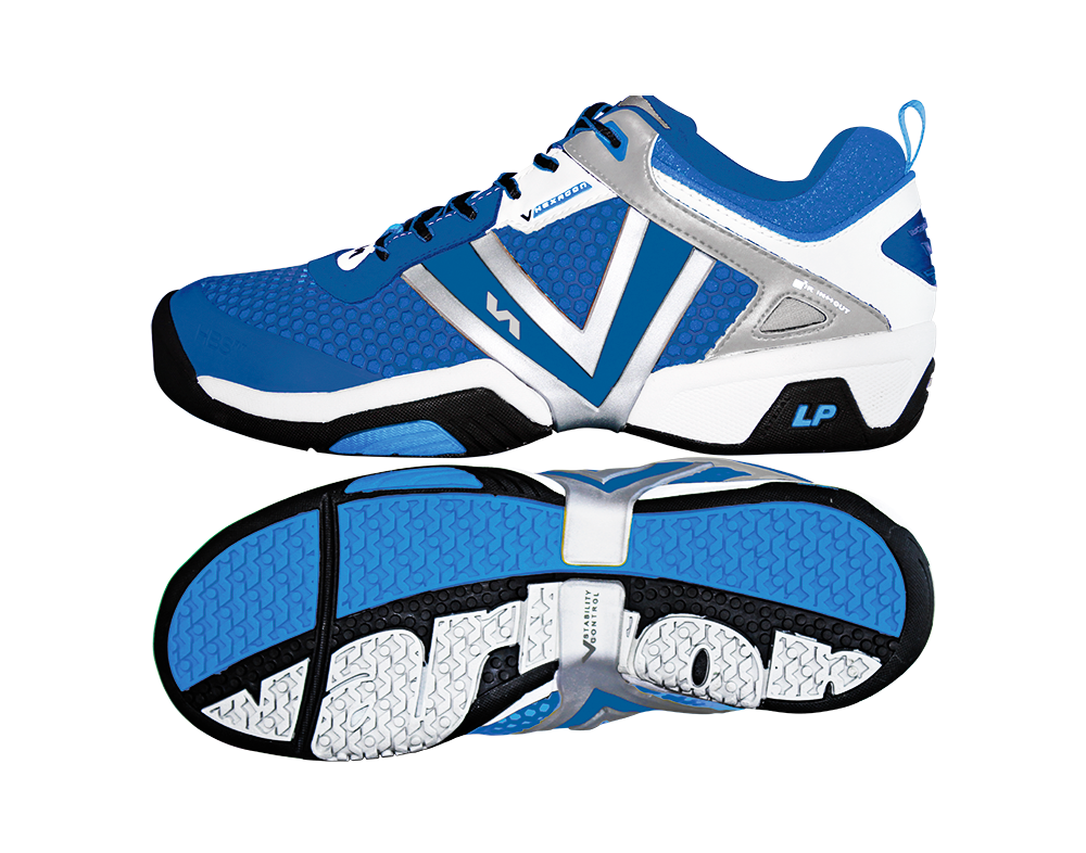
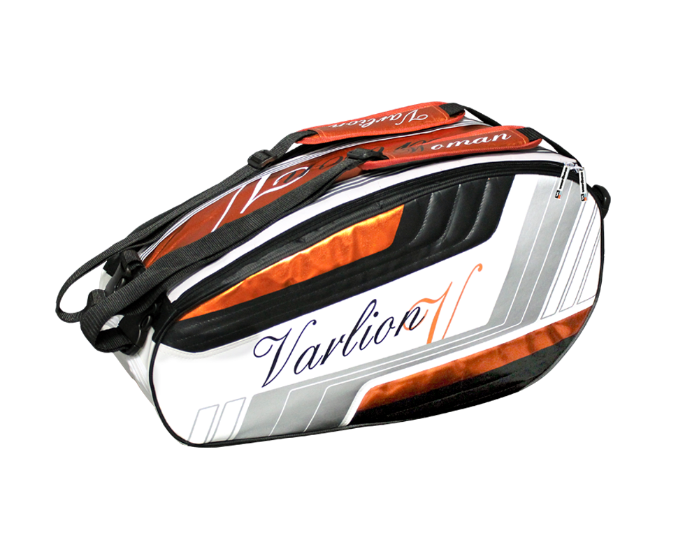
A special detail was taken in creating ranges of products and colors that would combine with each other, mainly among the Hexagon Difusor product range that would be the one that would lead the new collection of Padel Varlion brand products. The very name and concept Hexagon was moved aesthetically to the products of the same range, giving the same shape to the Bags or profiles of the Rackets as well as to the structure that would shape the last of the shoes.
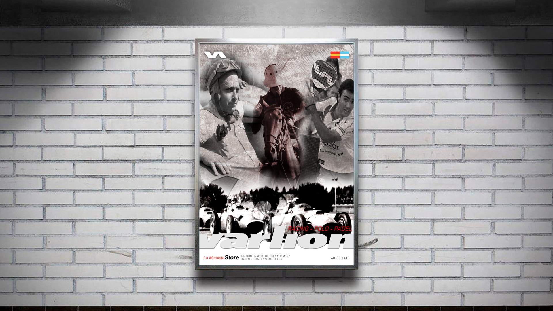
Advertising &
Communication
For the visual and communicative image, the brand decided that it should represent the three product lines that it was marketing at that time without wanting to give a greater prominence to any of them in particular. That is why a visual communication image was created based on Polo, Racing and Padel in common, also giving a retro look that would represent the 20 years of the brand itself.