STARVIE PADEL RACKET
METHEORA
Padel Products Specialist
SAIOR Padel Agency
Services:
Industrial Product Design, Product Brand Identity, Visual & Graphic Design, Visual Product Design, Advertising & Communication
Challenge
The challenge for this project was make an integral carbon composition, focusing especially on the piece that would sit in the heart of the mold of the Padel Starvie Metheora racket, adopt a structure of this type 100% carbon, without having to resort to PVC pieces to achieve a similar result. Being the first time that this type of piece would be made using the same technique and molding process as that of Padel’s own rackets.
Strategy & Solution
In order to carry out the objective that the brand had proposed. We had to find a design that clearly represented by its design the technological aspect that characterizes these types of elements when they are used to provide a plus to high-end models. Also being elements that provide balance, aerodynamic and anti-vibration systems to the rackets, as has been the case in similar systems created with PVC, which end up giving greater weight and less resistance than in Carbon.
Since carbon has a fabric-based molding system totally different from PVC, this being a more appropriate liquid injection system to achieve any type of shape. It was necessary to look for the limits of the edges and vertices that carbon molding allowed us, to achieve a piece that had the same technological qualities and could be represented visually.
Industrial Product Design
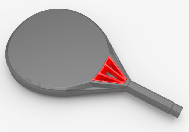
To develop our industrial parts and due to their wide design possibilities, we work with the great Rhinoceros 3D software.
Putting down to work, already based on the lines of the Starvie R base Padel racket mold, we began to work on the idea of the piece to be developed. Finally deciding to create a system of columns as internal spoilers that will increase the channeling of the air and at the same time give solidity to the structure of the paddle tennis racket. Looking for forms that will aesthetically provide the desired technological aspect for a high-end product.
Product Brand Identity
To develop the brand image that would give name to this model of Padel Racket and based on the meaning of the word METHEORA, we resorted to using the Coalition font family. Being this perfect to give that worn look that could be represented by imagining a rock or in this case a meteorite. In addition, without losing the technical, sporty aspect of the product itself and being able to use a wide body of typography to give greater strength and power to the word.

Graphic Image Design
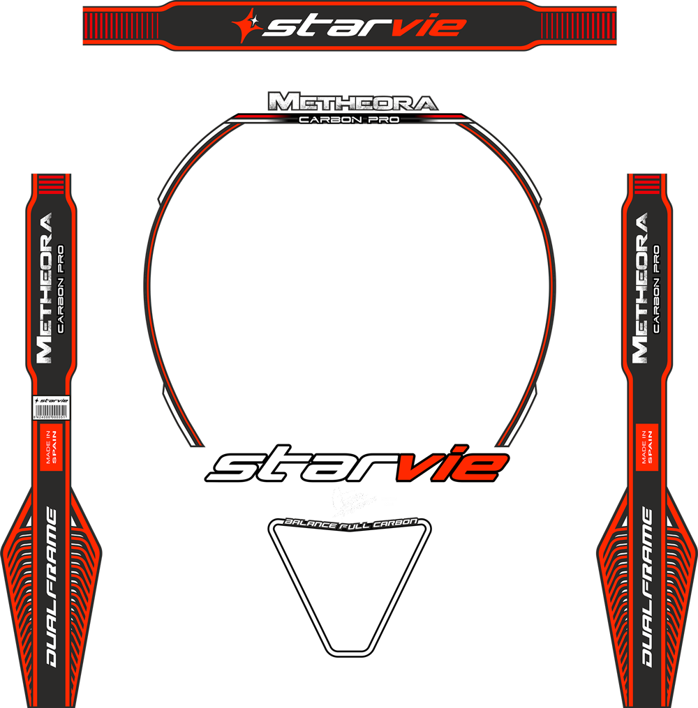
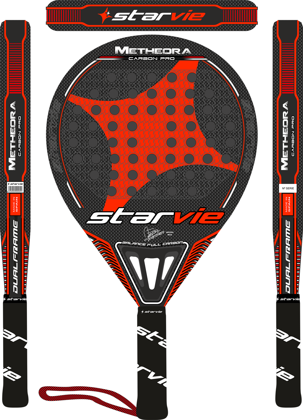
For the graphic image, starting from the fact that something with little design load and minimalist was wanted. If I try to highlight above all the part of the heart, to focus more attention to the new technological piece created without saturating and giving much more air to the part where the brand image was worked to achieve the same way that it was the that it had a greater prominence and recruitment.
For the rest of the elements, we opted for a design of lines that, in addition to highlighting the shapes of the racket mold, would give that futuristic technical aspect that something that comes from outer space must have.
Visual Product Design
The end result was a success, as a product with a very high-end appearance was achieved, being also one of the best-selling padel rackets of that year and of the new Starvie collection.


Advertising & Communication
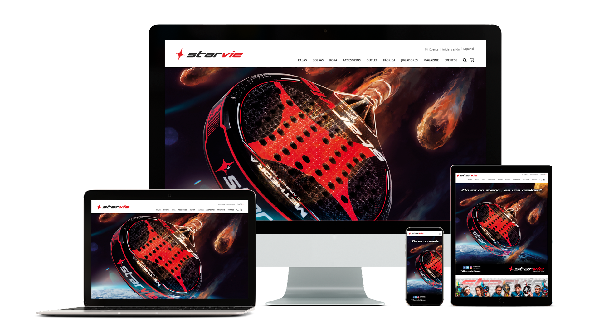
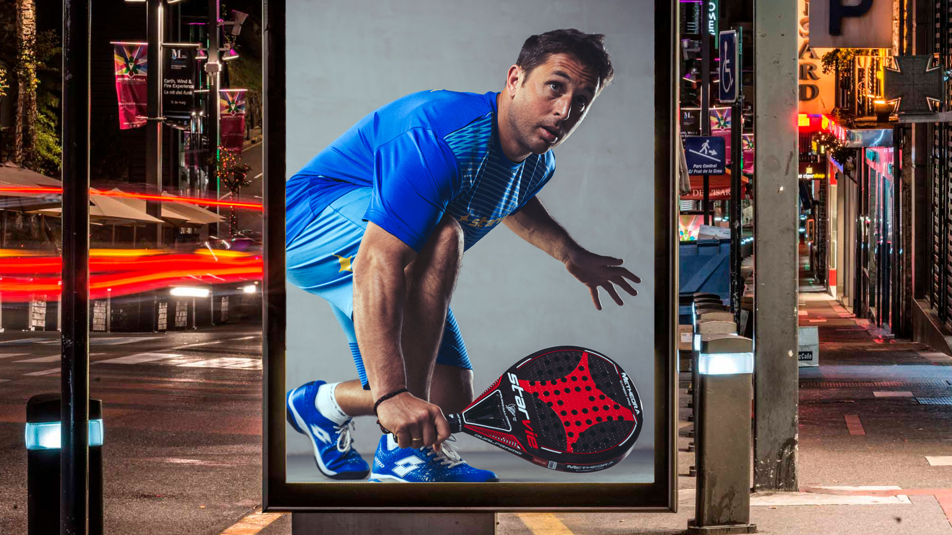
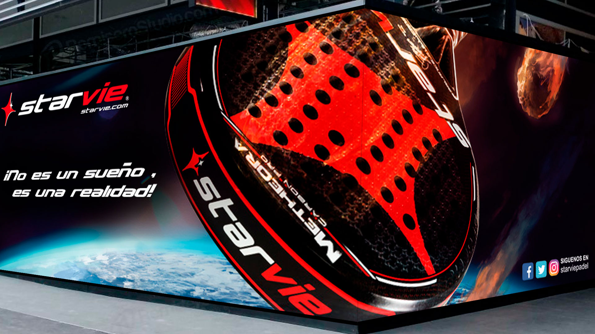
For the promotional and advertising launch of the METHEORA Padel racket, it was wanted to continue using the meaning of the same Branding as an idea. Thinking of Padel’s own racket that comes in the form of a meteorite to our planet to destroy everything. In this case to create the idea that it will have no competitor on the entire planet. Giving an appearance of a super racket that comes from another place in the universe, or from the Starvie universe itself.
JOIN THE COMUNITY
